Logo – it is that small piece of graphic which carries big responsibilities in the success of your brand. Logo is the first introduction to the brand. It influences the customer’s decision and affects the overall brand perception whether it is a new brand or an existing one. Apart from being symbolic of what your brand does and what it stands for, a logo represents your brand on social media posts, letterheads, pamphlets, hoardings and every marketing collateral you can think of. There is a lot that a logo has to do and there is a lot that goes into creating the perfect one. Here’s simplifying the process of creating the logo, whether you are starting a brand afresh or wanting to refresh an existing one.
Here are 5 things to keep in mind while preparing a logo:

1. Clean and Clever
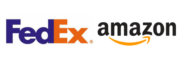
A good logo is always smart, clean yet easy to understand. Let’s exemplify the Amazon logo to understand this better. It is a very simple logo with smart play on its different elements. The yellow arrow from a → z denotes their wide inventory and it also denotes the wide smile their packages bring on everyone’s faces. Another great tip is to give blank spaces to keep the logo clean, while using those spaces smartly. Let’s take some inspiration from FedEx, it uses the negative space between E and x to create an arrow – which signifies speed and direction.

2. Colour is Crucial
Colours are not only about appearance or beautification, their importance is much deeper. Colours set the tone for communication and carry a certain vibe with them. For instance, blue invokes the feeling of community and togetherness. This is the reason why Facebook’s logo is blue. Red, on the other hand, is a colour which invokes aggression and mostly targets the younger age groups. Example: Netflix. While green denotes organic, yellow shows optimism and purple shows wisdom, and so on. There is a science behind every colour and this science acts like a bible for all professional creative agencies with seasoned logo designers. While bright colours engage the eye, they may seem too much. Lighter tones look elegant but they may fail to grab attention unless used in perfect balance.
3. Find Your Font
The typography depends largely on your target audiences. If it is children, there will be a handwritten font to make the logo and company look friendly. With thousands of brands popping up in the market, standing out has become the new normal. Therefore, it is always better to not use gimmicky fonts or fonts already used widely. It’s always better to create your own unique font family for your brand. If not that, search for some unique fonts available on the internet. Coca Cola is one brand which created its own unique font and there is no doubt its logo is imprinted on everyone’s minds.
4. Pick Your LogoType
The different types of logotypes makes logo-making difficult to choose from. There are various different kinds of logos but the most prevalent is wordmark – which is having a brilliant logo made with the brand name written. A great example of it is Noon, Amazon, Google, Hamleys, Dubai’s homegrown brands Huda Beauty and Mirzam chocolate, etc. The beauty of using a wordmark logo is that your brand name gets visibility parallely with your logo, thereby increasing brand awareness and recognition.
The second type of logo is Pictorial which is using the image of a certain object as the entire logo. Example: Apple, Lacoste. The next type is Abstract Imagery which is creating something unique and out of the box. Example: Pepsi, Starbucks. Abstract imagery is on the rage not only in the UAE markets but in all other major world geographies. Choosing the best logotype for your brand could be confusing and time-consuming but with the right set of logo professionals by your side, all you need to do is savour the magic of owning a good logo, brand-wise and business-wise.
5. Make it Scalable
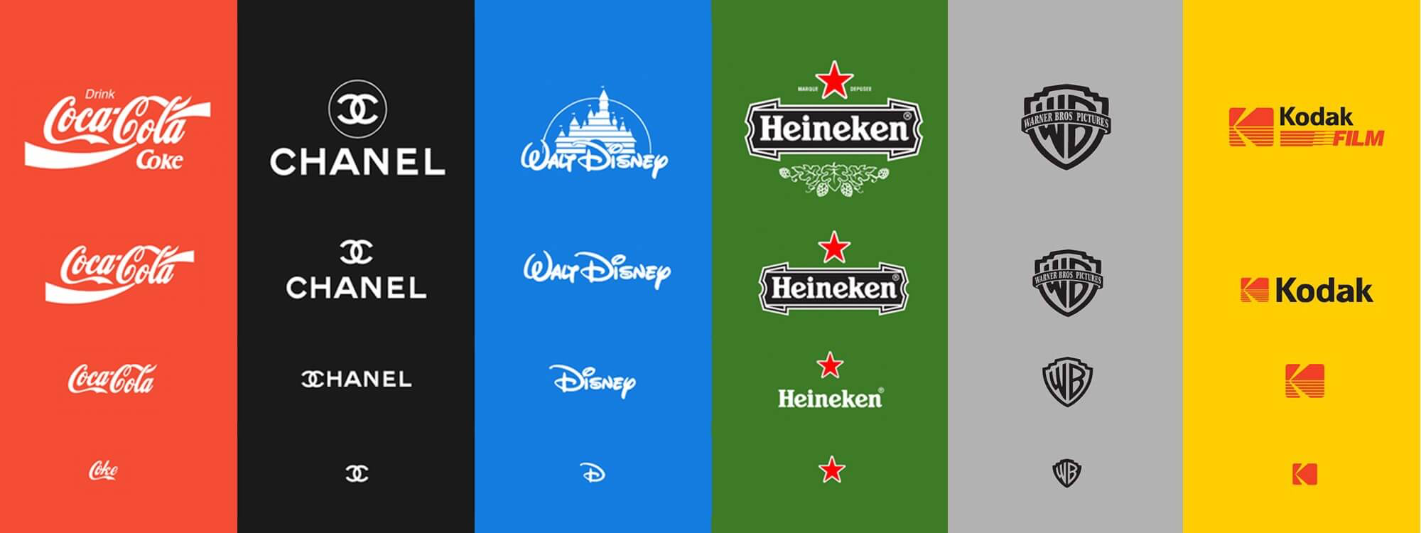
A good logo is versatile; it should look equally classic on a sheet of paper, a billboard and even a pen. If the logo is resized, its shorter version should be just as effective as its expanded version. Here in this picture, we can see some iconic logos looking equally good in all sizes.

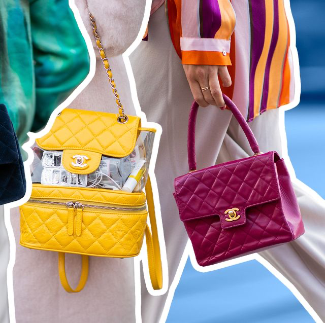
Take the example of Chanel. The smallest version of Chanel logo is used on the buckle of its handbags and it is essentially the buckle that makes the bag stand out from other brand’s bags. Now, that’s the power of a good logo!

Most brand owners sit down to create their own logo and mostly end up choosing a random logotype which looks good to their eye at that moment. Unless your brand perception holds no importance to you, random logos are a big no-no. At Vowels, we genuinely believe that your brand deserves the logo of your dreams and nothing lower than that should be accepted. Logo doesn’t change every year, it’s a long term asset, so settling for less is not an option here. Moreover, getting a generic logo made from crowded service-providing-sites or inexperienced freelancers can put your brand image at risk, without you knowing it. Trust professionals, join hands with like-minded creative agencies with specialisation in logo designing to weave the magic your brand deserves, today and forever.
From India and the Middle East to the US in the West, our brand consultancy is spread across different countries to assist all new businesses looking for a brand new logo and impressive brand identity, as well as old ones looking for a holistic corporate rebranding. If there is any question you might have regarding logo designing/branding/rebranding, please feel free to contact us.


